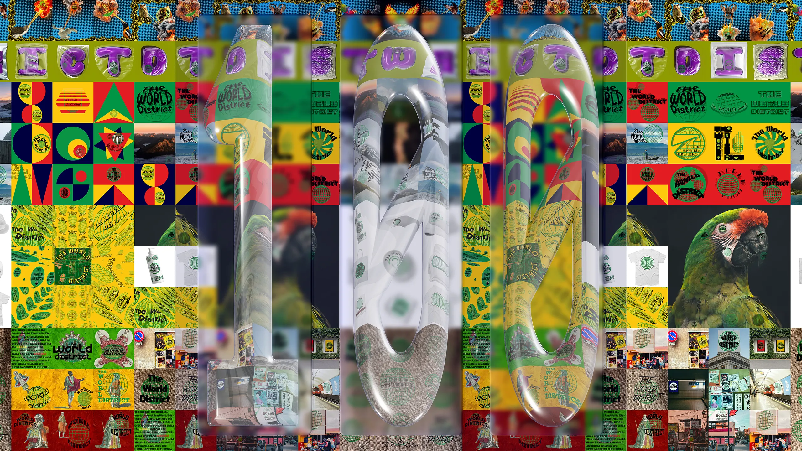
100 Logos in 100 Days
You got to start somewhere...
When I decided to get back into graphic design and start The World District, I needed to learn again. Not just remember, actually learn. School teaches you the fundamentals, but talent and capability atrophy if you don't keep using them. I'd been away from design for years, working in restaurants, in music, living life. Getting back in meant starting from discipline, not confidence.
So I gave myself a challenge. One hundred logos. One hundred days.
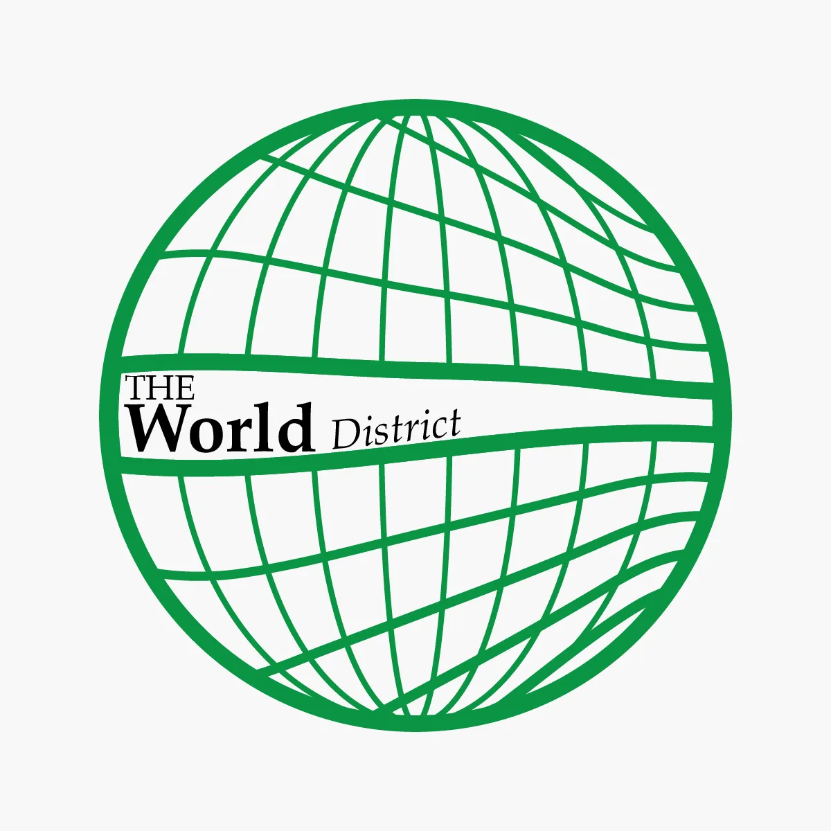
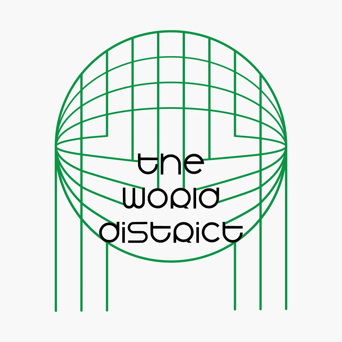
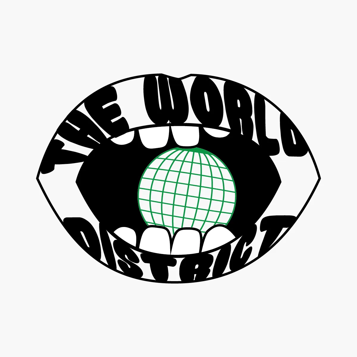
The process
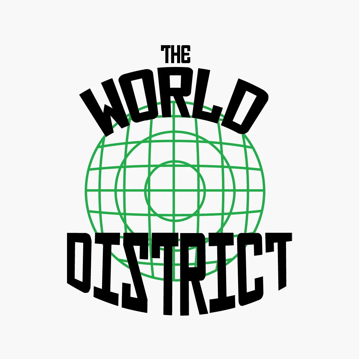
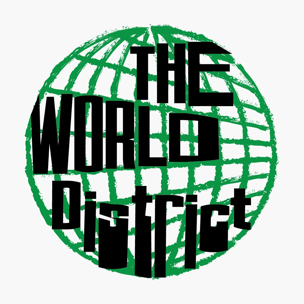
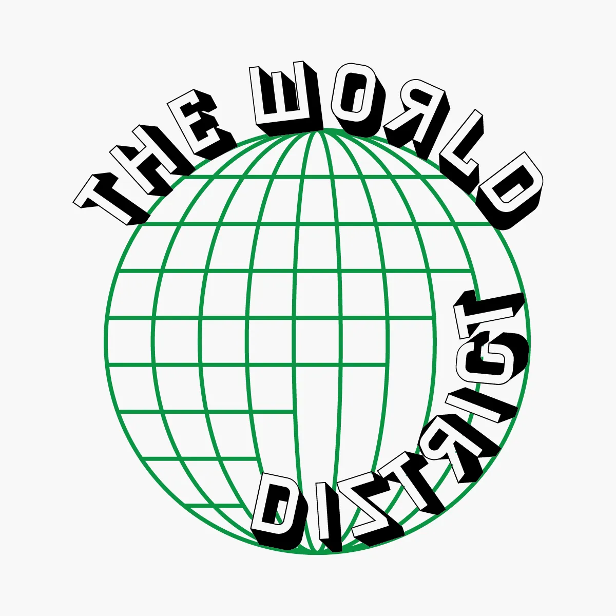
Every logo had the same rules. Green and black only. Thirty minutes, no more. Each one forced me to learn something new in Illustrator, or find a font I hadn't used before, and figure out how to make it work inside the same tight constraints as the day before.
I posted each one to Instagram as I went, the first hundred posts on the account that would become The World District. Some days the constraint felt impossible. Most days it just meant I got a little faster, a little more decisive, a little more myself.
Logo 95 became this company's actual logo. A hundred days of practice, and the one that stuck was near the end, not the beginning. That felt right.
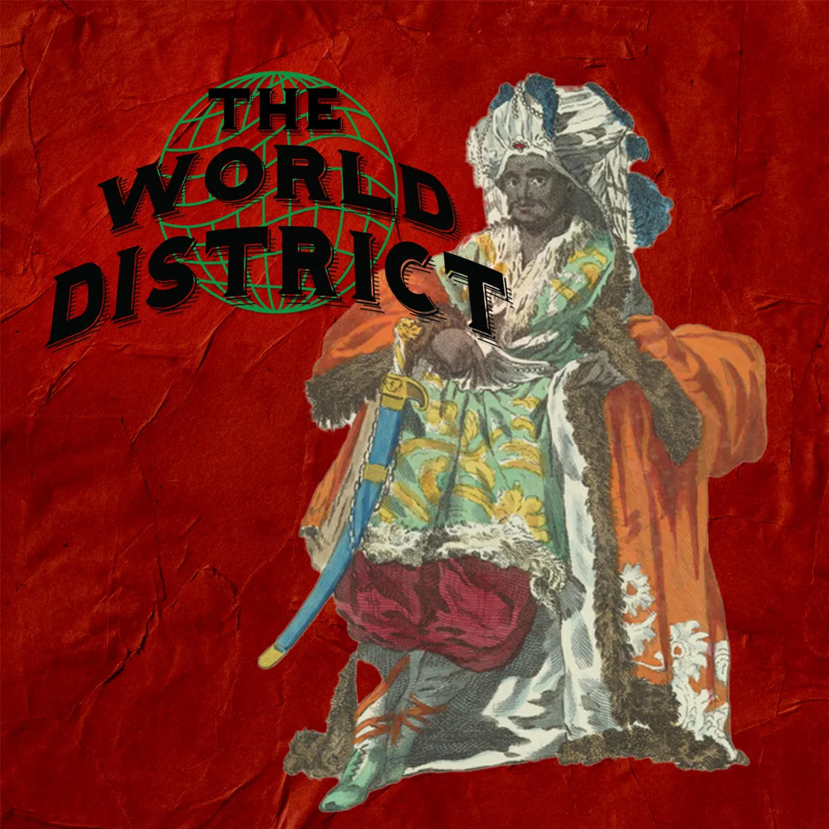
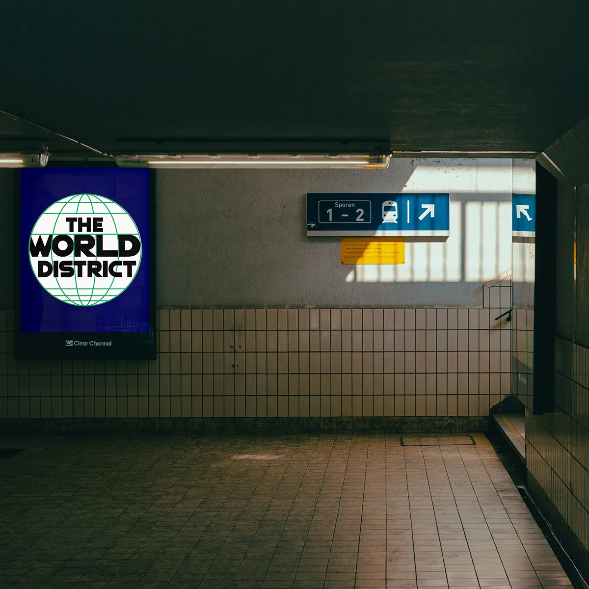
These hundred logos didn't just sit on a page. Each one became a design element in the first hundred posts on The World District's Instagram, dropped into illustration collages, mocked up on billboards and transit ads, placed into whatever world I built around it that day. Looking back at them now feels like flipping through a diary. You can see the day I finally understood negative space. The day I got tired of green and black and made it work anyway. The day I stopped overthinking and just built the thing.
That account, and this whole company, started with a constraint and a hundred days of showing up for it.
See all one hundred, and the constraints behind every one, in the full archive, or see how they came to life across my first hundred posts on Instagram.