Bold Lashes.
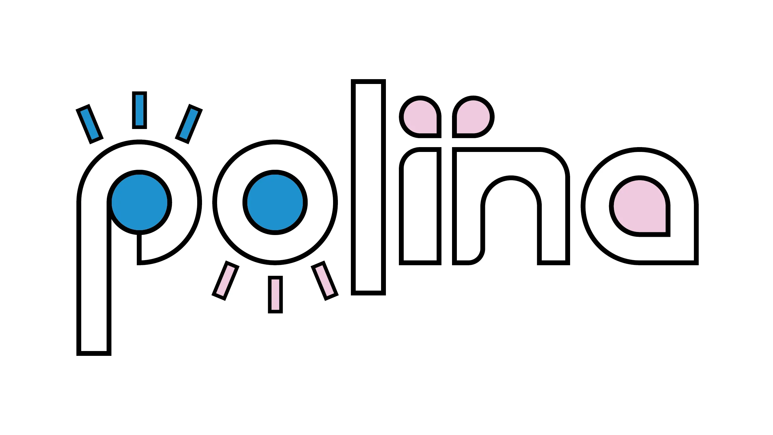
Polina was a lash technician about to launch her own business. Looking at the North American lashes industry, every brand looked the same. Soft scripts, pastel colours, predictable femininity. Nothing that stood out. Nothing that stayed with you.
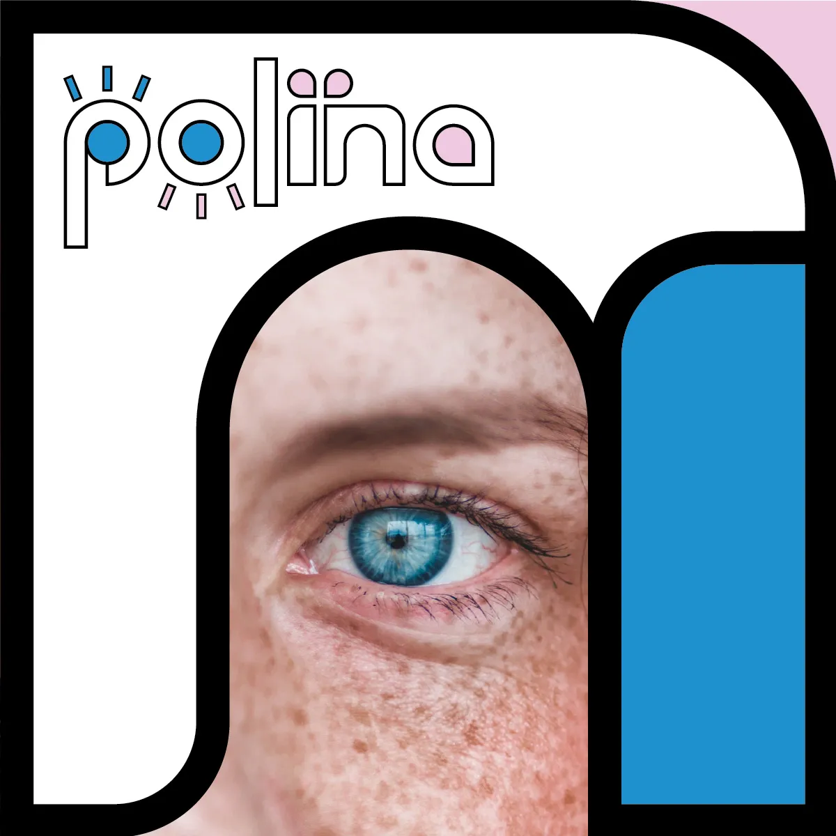
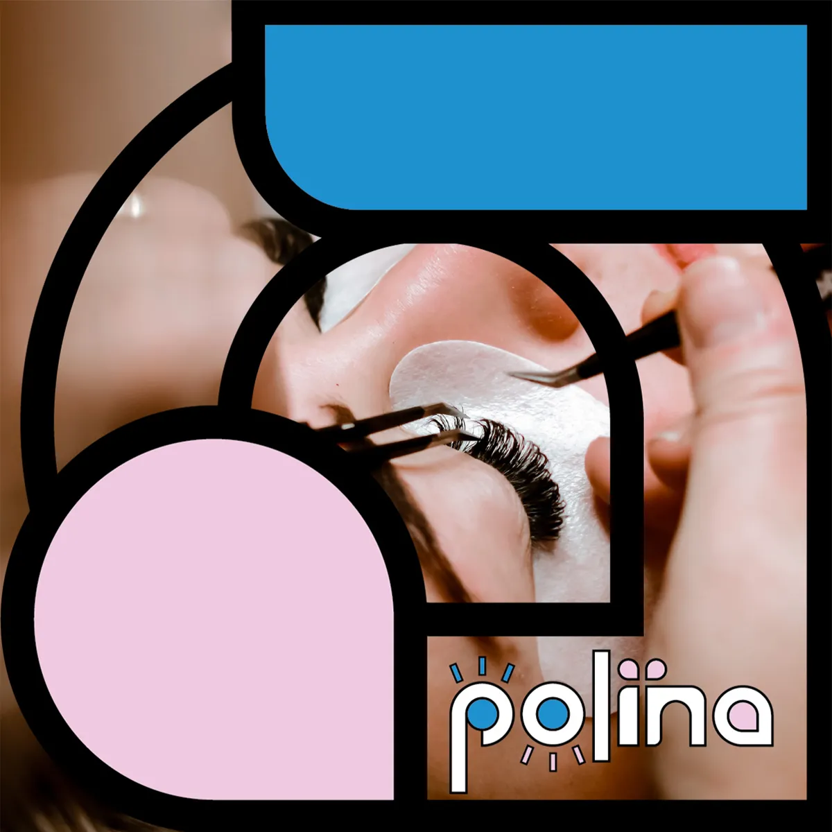
I saw an opportunity. Instead of following the crowd, I looked to European aesthetics. Bolder, more graphic, more unexpected. The result was a geometric wordmark that had nothing to do with what lash brands were supposed to look like. And everything to do with being clean, fresh and trustworthy.
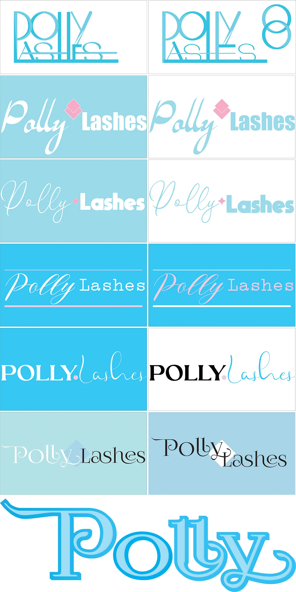
Polina loved the concept but wanted to explore a softer direction using her nickname Polly. So we went there too. Softer scripts, teal and pink, more familiar to what she knew. Multiple directions, multiple colour combinations.
In the end we didn't move forward together. She went to work for someone else and the business didn't launch.
But the work stands on its own.