Fruit Series: Taste of Where They Grow
I've always admired rar3hare's flower posters on Instagram. Bold color, riso texture, English and Japanese type working together. When I moved to Japan, that bilingual layout started to make sense in my own work too.
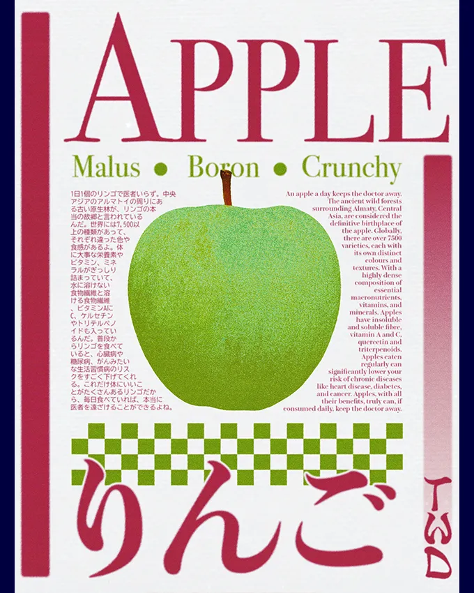
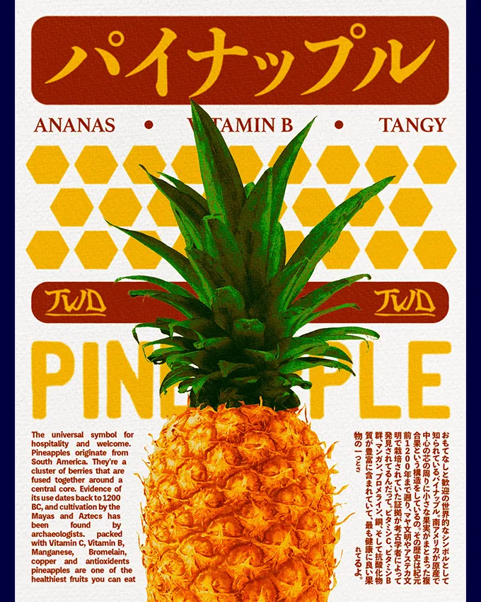
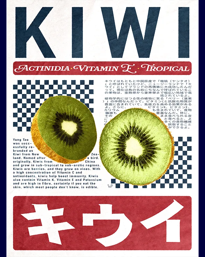
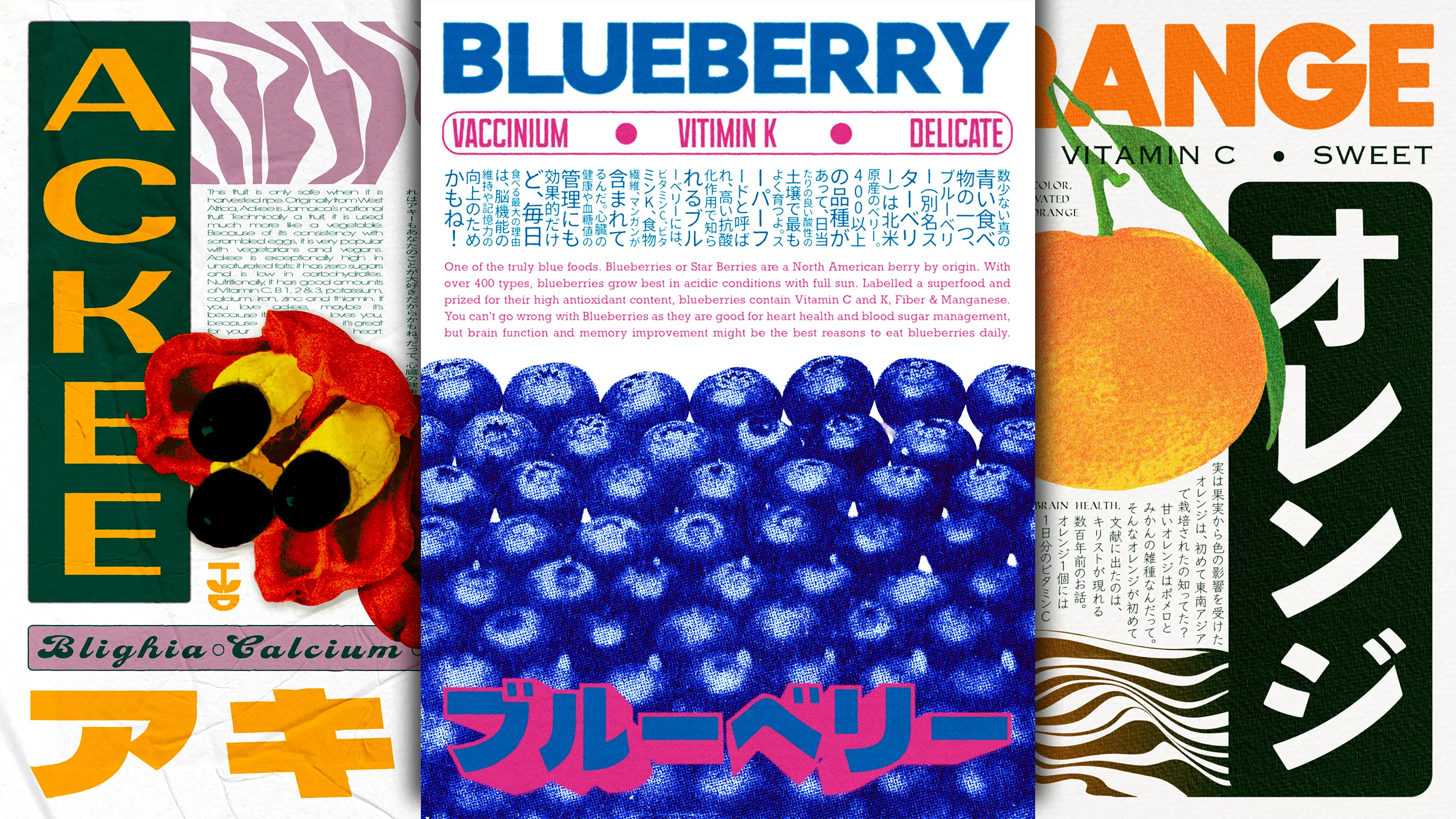
Instead of flowers, I chose fruit. Each poster ties back to a place, the country or region where that fruit is most at home. Papaya and the Dominican Republic. Orange and Thailand. Blueberry and the wild fields of North America, where it doesn't belong to one country, it belongs to a whole continent.


The process
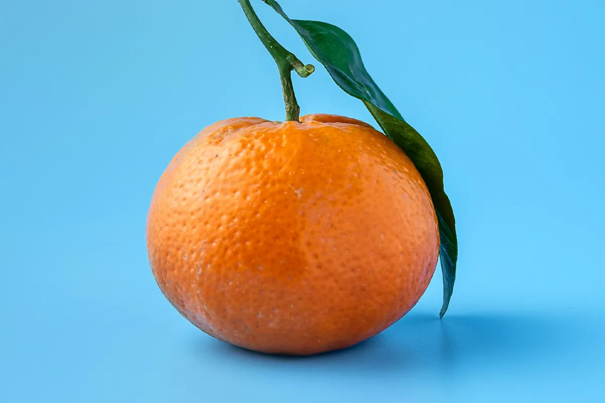
I start with a real photo of the fruit, then take it into Photoshop and rebuild it by hand. Color, grain, texture, one layer at a time, until it stops looking like a photo and starts looking like something printed on old paper.
For most of these posters I also designed a custom letter-mark logo, built from the Japanese font I used for the large display type in that specific poster. Every poster carries nutritional facts and small stories about the fruit, written in both English and Japanese.