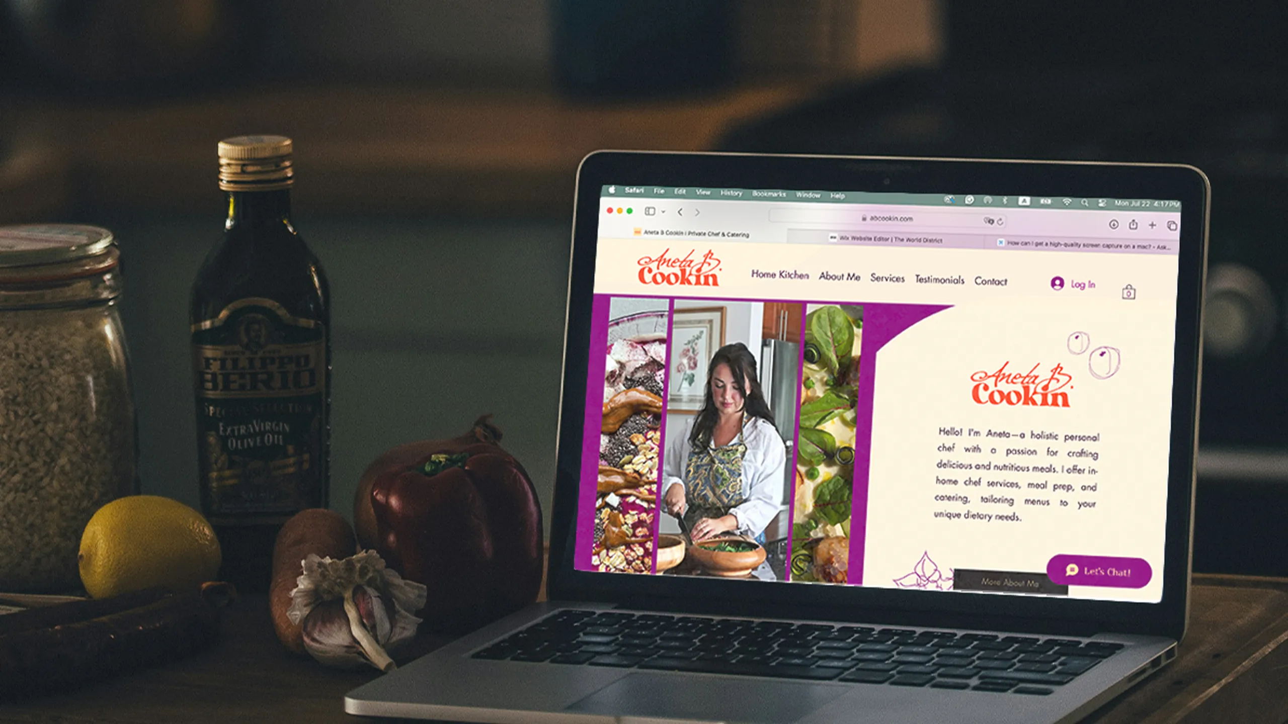
Aneta B. Cookin brand identity and website displayed on a MacBook in a kitchen setting. Logo design, visual identity, and Wix website designed and built by The World District.

From Serving Tables to Serving NHL Players

Aneta B. Cookin brand identity and website displayed on a MacBook in a kitchen setting. Logo design, visual identity, and Wix website designed and built by The World District.

From Serving Tables to Serving NHL Players

She Didn't Even Have A Name…..

She Didn’t Even Have A Name…..

For her company, that is.

For her company, that is.

Aneta and I met across a restaurant floor in Toronto both serving tables. Between shifts we talked about our dreams. Hers was clear: her own private chef company. She was already cooking privately for clients, but doing it all under someone else's name.

That's where it started. I came up with the name: Aneta B. Cookin. Aneta Burzinski. Aneta Be Cooking. A play on words that was literally just stating the obvious. The moment she heard it, everything clicked.

A name, a logo, a visual identity, that's what she needed to make the leap from dream to reality. So we built it together. And once she had a brand that looked and felt like her, the website to share with the world.

Aneta and I met across a restaurant floor in Toronto both serving tables. Between shifts we talked about our dreams. Hers was clear: her own private chef company. She was already cooking privately for clients, but doing it all under someone else’s name.

That’s where it started. I came up with the name: Aneta B. Cookin. Aneta Burzinski. Aneta Be Cooking. A play on words that was literally just stating the obvious. The moment she heard it, everything clicked.

A name, a logo, a visual identity, that’s what she needed to make the leap from dream to reality. So we built it together. And once she had a brand that looked and felt like her, the website to share with the world.

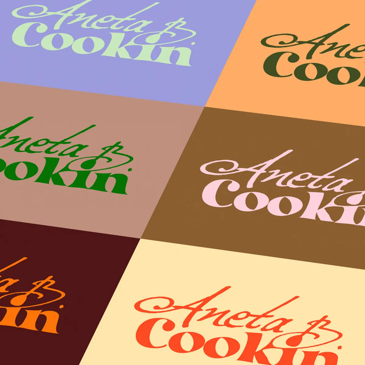
Aneta B. Cookin logo colour explorations. Wordmark tested across multiple colour combinations and backgrounds, brand identity designed by The World District.
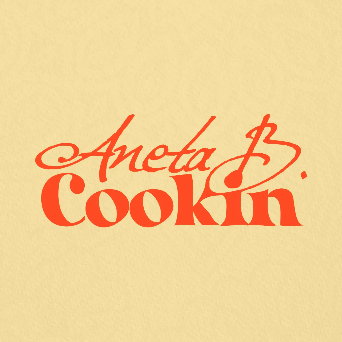
Aneta B. Cookin final logo on cream background. Orange wordmark with hidden spoon detail in the letterforms, logo designed by The World District.

The Name Became The Logo

We built a wordmark using two fonts as a foundation. "Excellentia in Excelsis," a handwritten script chosen to reflect Aneta's elegance, and "Curvilingus," a playful serif that captures her fun, warm personality. Both were tweaked and customized until they became something unique to her.

Look closely at the B. The straight left side becomes the handle. The dot of the i becomes the bowl. A spoon "Aneta stirring up something delicious" …hidden in plain sight.

We brought it to life with an animation showing the spoon in motion. Once you see it, you can't unsee it.
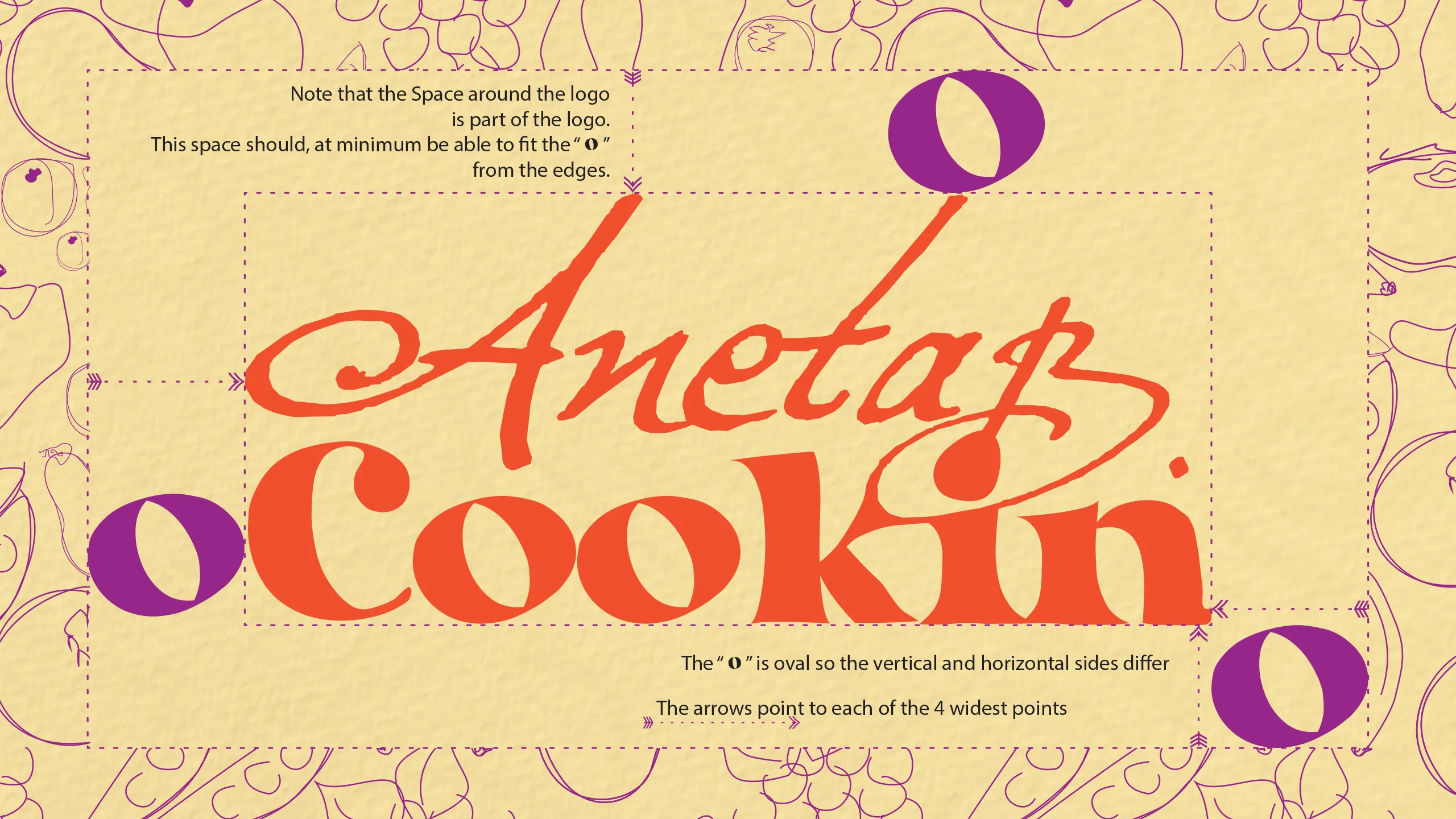
Aneta B. Cookin logo spacing guidelines. Brand identity style guide showing clear space rules, designed by The World District.
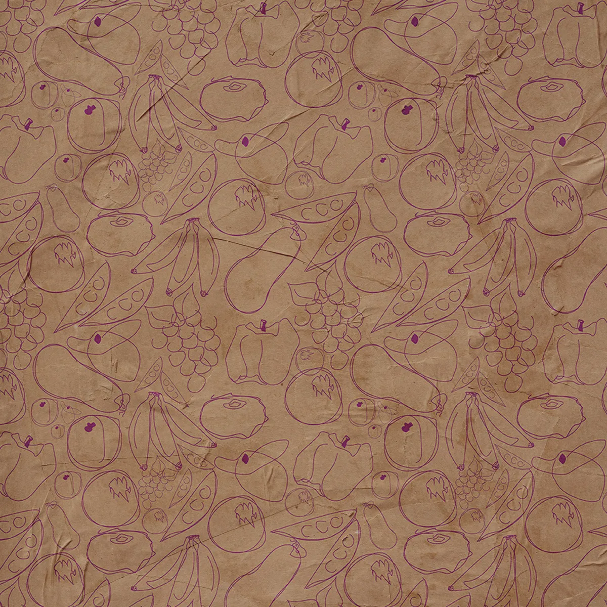
Aneta B. Cookin custom fruit and vegetable doodle illustrations on kraft brown paper, hand-drawn pattern designed by The World District for use across brand touchpoints and packaging.
Aneta B. Cookin custom fruit and vegetable doodle illustrations on cream texture background, designed by The World District.
Aneta B. Cookin brand background, warm cream base colour, named Creamed Honey.
Aneta B. Cookin brand background, black and white mandala pattern layer.
Aneta B. Cookin brand background paper texture layer.
Aneta B. Cookin brand background, final textured background combining colour, mandala pattern and paper texture, designed by The World District.

Visual Identity Around the Logo

Aneta had once started a webpage with a mandala pattern she loved. We took that as our starting point, combining it with her brand colour, Creamed Honey, and a paper texture to create a warm, layered background that felt like it could only belong to her.

The doodles came next. I drew each fruit and vegetable by hand: bananas, grapes, peas, peppers. A completely original illustration set made specifically for Aneta B. Cookin. No stock. No templates. Just something that felt as personal and warm as the food she makes.

Together these elements became the foundation for a complete brand style guide, giving Aneta everything she needs to show up consistently, wherever she goes.
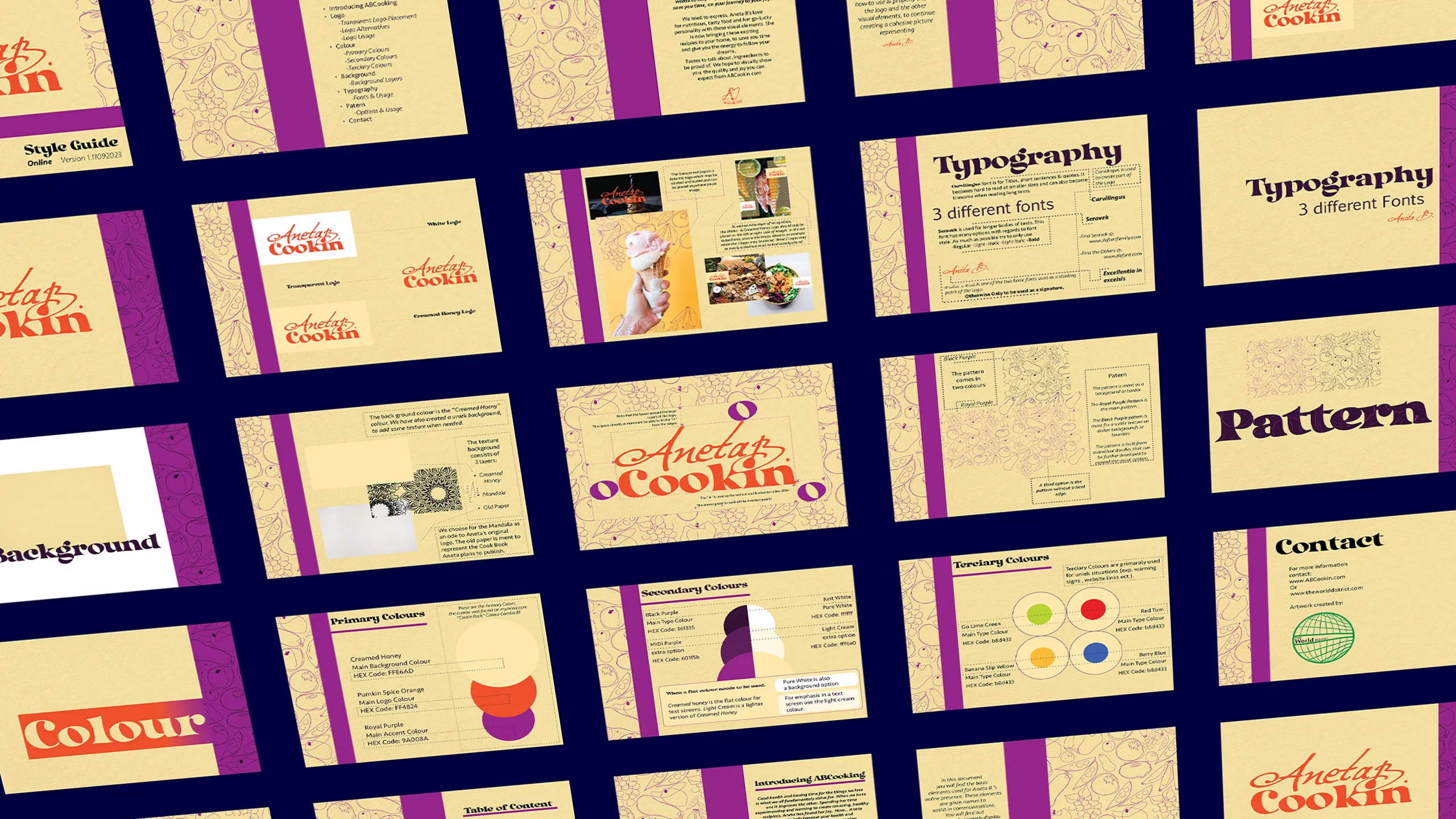
Aneta B. Cookin brand style guide overview, selected pages showing logo, typography, colour palette, patterns and background system, designed by The World District.
Aneta B. Cookin website displayed on iPhone mockup, showing the homepage with food photography and brand identity, designed by The World District.
Aneta B. Cookin custom fruit and vegetable doodle illustrations on cream texture background, designed by The World District.

She Didn't Just Launch. She Flew.

With the brand complete, we built her website on Wix. We chose a platform Aneta could learn to manage herself once we handed it over. We brought the full visual identity into the site, set it up, and handed her the keys. Aneta has taken care of it ever since.

Within months of launching, she went full time with her company. The brand and website gave her the confidence and the credibility to make the leap she had been dreaming about across that restaurant floor in Toronto.

Not long after, she was cooking for professional athletes from the NHL and MLB who trusted her with their nutrition. From serving tables to serving the players. That's what happens when you finally have a brand that shows what you're worth.

If you're in the Florida area, she's now living and working her best life there.

Aneta B. Cookin logo on Creamed Honey background beside a charcuterie spread, brand identity designed by The World District.
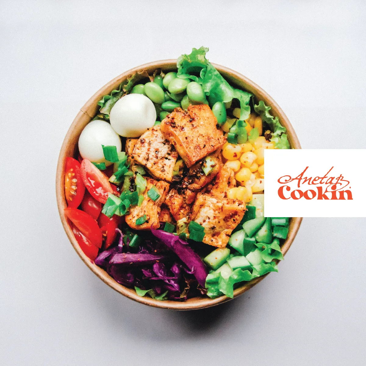
Aneta B. Cookin logo on takeout food packaging mockup, brand identity designed by The World District.
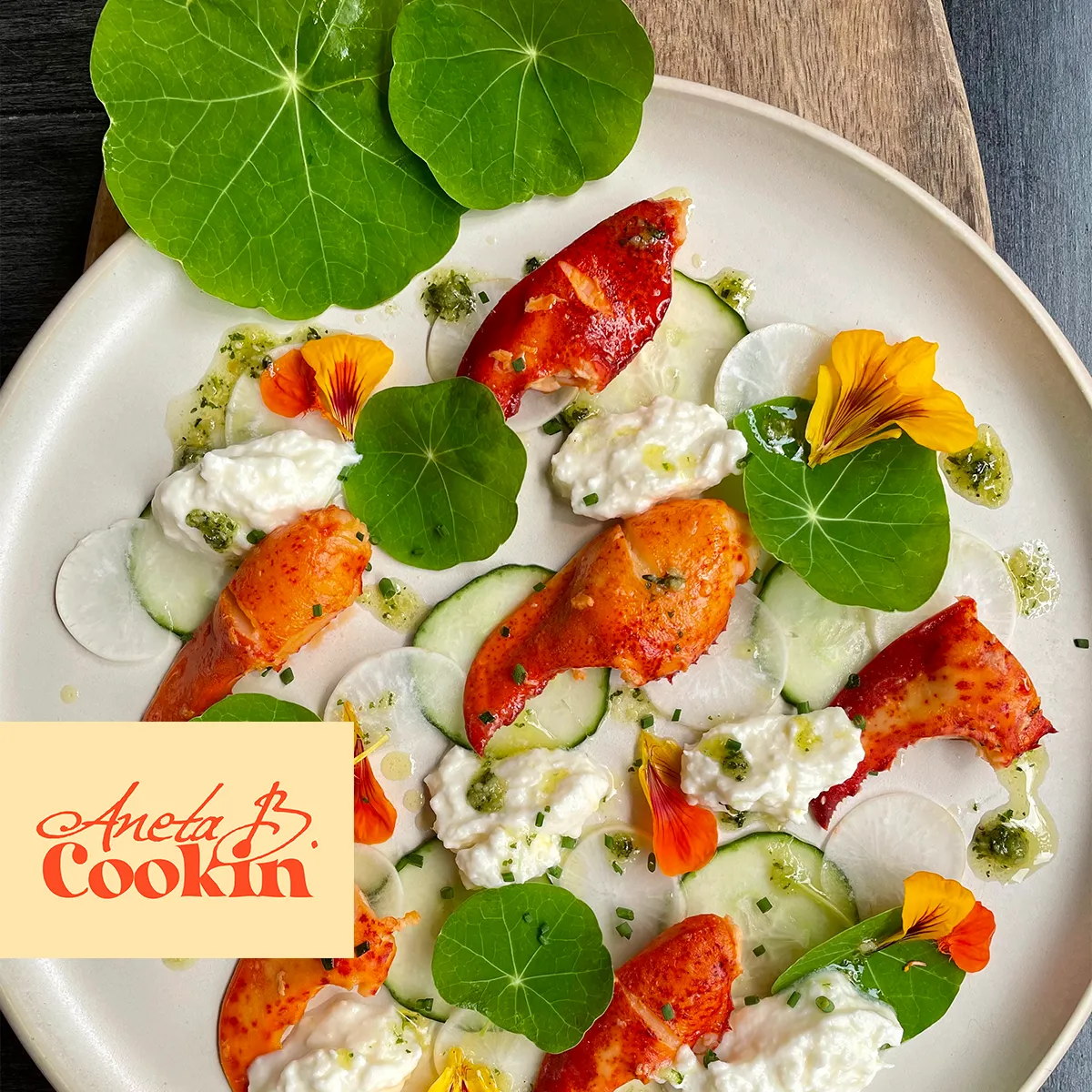
Aneta B. Cookin logo beside an elegant lobster claw dish with edible flowers, showcasing the brand in a fine dining context, designed by The World District.
Aneta B. Cookin logo and fruit doodle illustrations on golden yellow background with ice cream cone, brand identity designed by The World District.

© 2023-2026 The World District. All rights reserved

Company

About Us

Portfolio

Lets Work

Socials

© 2023-2026 The World District. All rights reserved

© 2023-2026 The World District. All rights reserved